Party Like it’s 1997: The Curse of the Back Button22 days beforeHaven’t you heard? DHTML is cool again. Now, before y’all run out…
Graphics and Structural Markup: Keeping “pretties” out of content
Pet peeve time! Let's talk graphics. You know, the catchy visual dujibobs that have been part of the Internet since the Gopher went south. As far as I know, there are only two types of graphics on the Web: content graphics and presentational graphics.
- Content graphics comprise the content of the page or serve as illustration for text content. For example, a news story on nuclear research breakthrough may feature a photo of a glowing (pardon the bad pun) scientist in a hazmat suit. A page containing a gallery of pictures with cut lines could serve as another example of images as content.
- Presentational graphics serve the decorative purposes of a page. Typically, these are ingredients for what you'd call "page template" – they survive, with some degree of consistency, from page to page on a site. Taking away or changing the presentational graphics does not affect the content of the page. The nice white-space background texture that makes your eyes feel happy, or the heading that expresses the spirit of the site, or rounded corners that give your sidebars the look of a candy bar – all of the above are presentational graphics.
Another, less obvious example of presentational graphics is using images to convey textual information. Very often, Web sites can be found using titling (and sometimes more) that is rendered as images. See, text looks much better when kerned by hand and licked clean with anti-aliasing in Photoshop in a font that's something other than the common serifs and sans-serifs given to us by Web gods. And in the absence of a standard font delivery/rendering mechanism, provided by CSS or (X)HTML, developers use ye olde GIFs to compensate.
However, as I mentioned earlier, these images are context, not content. Why? Well, because from the perspective of content, we could care less about how it looks. We just want information. The "pretty" part is thus presentational, and only the actual textual information that is represented by the image is content. Can't decide who you really are, eh?
Images and structural markup
Of Men with the Brain on Both Sides and a Utopian Cult2005One other thing that I had in my comment is an offer…
Obviously, presentational graphics have no place in structural markup. Only content graphics deserve to have their own designated image elements in the markup. The rest will have to take a ride on a CSS bus. Luckily, the color and background family of properties gives you more than enough flexibility in accomplishing that, and A List Apart is a good starting place in getting a taste of common techniques.
PHTML: Dumbing It Down For Sanity’s Sake2004If you have built large sites, you have faced a familiar maintenance…
What of that MPD-afflicted "text as graphic" case? If we tuck our graphical titling into CSS backgrounds, we hide content in the presentational land, because these graphics contain textual information. If we make them into image elements, we have presentational elements in the content, which is even worse. What shall one do?
Because the initial reason for having text as graphics is due to incomplete rendering paradigm, there is no perfect solution. But there are a few that come pretty darn close. I am talking about the family of image replacement techniques. They all approach the issue from the same angle: textual information is marked up as text, but replaced with images using clever hacking with CSS, client- or server-side rendering. That way, the markup stays structurally correct, and the layout engine of the browser is augmented with new capability to make the text look more appealing. The major limitation of these techniques is that they're hacks, and like any hack, each technique has it Achilles' heel:
- Static image replacement (FIR being the first, Leahy being my current favorite) still requires you to break out your Photoshop if the text information in the images changes.
- Client-side dynamic image replacement (sIFR is the best example) has additional expectations on technology support (Flash is required), does not provide enough presentational flexibility (you can't hand-kern something that's generated on-the-fly), and may have accessibility problems (try reading sIFR-enabled page with the latest version of JAWS).
- Server-side dynamic image replacement (DTR comes to mind) places extra computational burden on the server and has the same flexibility and, to a lesser degree, accessibility issues as its client-side counterpart.
Micforormats: Yay or Nay?2006In my opinion, marking up content with microformats falls right in the…
However imperfect, image replacement is an enabling technology. Without it, presentational aspects of the page would have been the sacrificial lamb of structurally-correct markup. I doubt structural markup would've had a chance of making it to the mainstream.
Brand is content?
Very often, it is tempting to regard branding elements on a page as presentational. Branding elements are part of the letterhead, not the letter itself (letterhead being the presentational part of the page, of course). But in reality, the situation is a little trickier. In most cases, brand is as important as content on the page and deserves to be counted as content. Here are a few examples:
Point: The university seal is often used on a page to signify that the content comes from official university sources. Removing the seal from content diminishes the authority of the page. Thus, the seal is content.
Counterpoint: This is the case of mistaken identity. The seal itself is not content. The content is the phrase "This page is part of the official university content", which is implicitly stated by the presence of the seal.
Point: The logo of a company on a page was re-colored to match the theme of the page, has been given gradient fill and a drop shadow to make it look "pretty". Anything "pretty" is part of presentation, thus making the logo a presentational graphic.
Counterpoint: The changes in logo appearance are indeed presentational. However, being the unique mark (title) of the company, the unaltered logo itself is still content. Therefore, the unaltered logo graphic may be part of page content, only to be later replaced by the spruced-up presentational version. Think of it as using image replacement technique for an image.
Hyperlinkin' graphics
Web wouldn't be Web without hyperlinks. Those pesky anchor elements define the essence of surfing, the brand new user experience that was born with the Web. Many times, the item that the Web surfer clicks on is a graphic. Now, quick: is this a presentational graphic or content?
To answer this question, let's examine the nature of a hyperlink. A hyperlink is a way to link from one page to another, which identifies the target of the link on the page that's the link's starting point. Naturally, identification of this link is content.
Yes, but what kind of content? As any of known accessibility guidelines (WCAG, Section 508, etc.) would tell us, this content must be textual in order to be interpretable in absence of the agent that supports visual content. Therefore, from the perspective of user experience, the textual nature of the link is more important than its visual representation.
This means that any graph
ics that are part of hyperlink are probably presentational. They are there to make the link look "nice" or "pop", not to identify the target of the link.
Comrade, what about my image maps?
Image maps are about as evil as you can get from the perspective of structural markup. Think about it: it's a markup construct that was devised to arrange links (content) on a graphic using 2-dimensional, pixel-oriented system of coordinates, which is as presentational as you can get. Stay away from the image maps, they are the heathen borne from Devil's womb. Especially, since you already have a presentational vehicle such as CSS.
Rules of Thumb
- The image is definitely content, if
- It is referred to in the textual content. For instance, "This diagram depicts the relationship between good and evil (see figure 1)"
- If removed from the page, affects the value of content
- The image is probably content, if
- It was created specifically for this page
- It is unique for this page
- The image is probably presentational, if:
- It's clickable
- It was borrowed from stock library
- The Objective of Information Architecture2004
Users don’t care about where they are on the website — they…
It is present on multiple pages with a degree of consistency - It lends itself better to a GIF format
- The image is more than likely presentational, if:
- If removed from the page, does not affect the value of content
- It contains textual information that would be considered content if it were just text.
Image element Quiz 1
Following the spirit of this article, how many image elements will you need to develop markup for the following composition?

Image element Quiz 2
Microsoft.com Redesign2004Consider organizing ALL of your lists of links into… er, lists, using…
Think of what XHTML markup you would write for the composition below. Specifically, what would you use to express the icons (I assume it's obvious that they are clickable)?
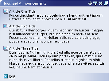
Image element Quiz 3
Visit the following Web sites, view their source and point out images are incorrectly marked up as their own elements:
- http://www.sun.com/
- http://www.ibm.com/
- http://www.linux.org/
- http://www.microsoft.com/
- http://www.glazkov.com/
The Cruelty of Unattainable Perfection2004
First, there was pristine perfection: a vision of a mark up language…Note to the user from the utopian future: If you are looking at my page and can't find any examples of bad structural markup, you bring me the happy thought that I finally did find time to redesign my site. If you can't find anything wrong with any of the Web sites listed, you are either overlooking something or the future is looking so bright that I might just have to get me a pair of shades.
TILT: How to Stop Feeling Bad About Using Tables for Layout and Start Enjoying Your Markup14 days afterYou must be really living out in the sticks if you haven’t…
Cheesecake and Baklavalinks here, 2022To compare and contrast, let’s look at Cascading Style Sheets. It’s fairly…
With any luck, this article shares your current thinking. Or maybe it gave you something to argue about (that's what the comment form at the bottom is for). In either case, next time you code presentational graphics as image elements, I hope you see it as adding ugly warts to the beautiful face of your Web site.
Show 1 comment
Cheesecake and Baklava – Dimitri Glazkov linked here · April 6, 2022
[…] I was wholly enamored—and honestly, still am—with such a groundbreaking idea. I even wrote an article or two or three (Hello, 2005! I miss your simplicity) about best practices for content/presentation […]